The project integrated three different components, all competing for the top section of the overview page, despite a series of reversed launching dates. Fluidly adapting to new requirements while logically planning for a smooth launching sequence was the key to the success of all.
[FYI: The hero image was AI-generated 😄 ]Context:
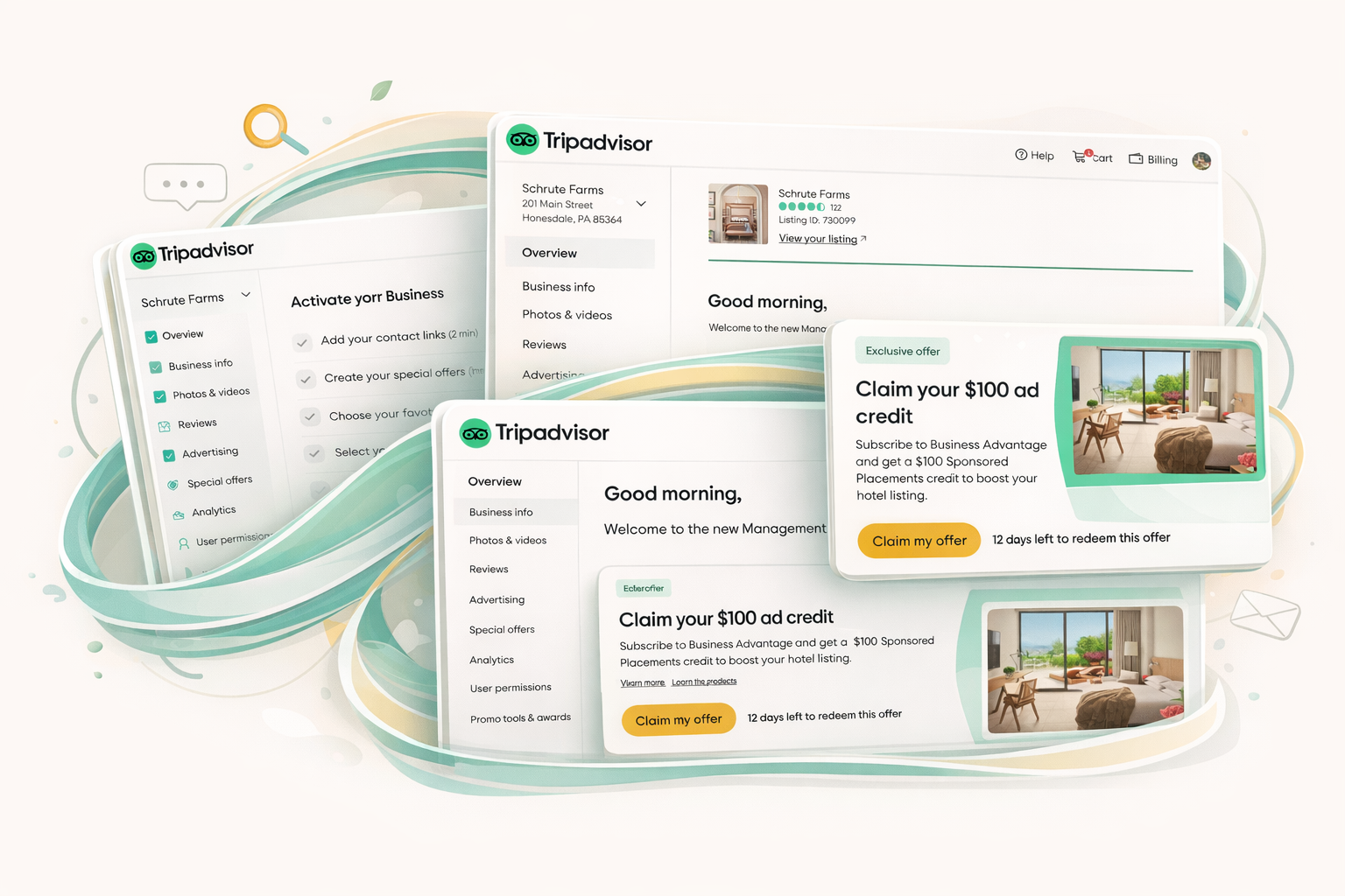
This case study focuses on integrating three separate features—the Next Best Things (NBT) component, the Starter Checklist (SC), and the Free Trial banner—within the management center overview page. All three components were slated for prominent placement at the very top section of the page.
The process began with the NBT project, followed by the addition of the Starter Checklist, but the Free Trial project then requested launching ahead of the other two, resulting in a reversed and scattered launching timeline. In theory, the optimal user journey would require a user to interact with the Starter Checklist first, and only then graduate to seeing the NBT.
The Challenge: Tightly Entangled UX and Scattered Launching
The primary challenge was managing the tightly entangled UX. Since all three components were located at the very top section of the overview page, they competed against each other for prominent placement. This required strategic analysis and planning for how these components would coexist, while alternating their visibility based on the user journey.
Further complexity arose from the scattered launching timeline. The launch dates requested by the product teams were “totally out of order” compared to the defined ideal user flow. The entire user flow and working process shifted multiple times due to new ad-hoc projects and additional requests during ongoing design activities. To maintain a good user experience, the team had to devise multiple temporary solutions to keep the page composed during these fast-shifting stages.
Solution: Defining Component Relationships and Strategic Placement
A comprehensive UX definition was needed to manage how the Starter Checklist, NBT, and Free Trial banner would ultimately coexist.
Key Components and Roles:
- Starter Checklist (SC): This component is the initial touchpoint for new users on the page. It serves five key activities to help a new user orient themselves and quickly get familiar with the management center basics, such as confirming business information or responding to reviews.
- Next Best Things (NBT): This component only appears after a user graduates from the Starter Checklist. The NBT is a card that provides a personalized recommended action based on the actual situation of the listing. For example, it might encourage a user to upload a new photo if the latest was posted a month ago. The component usually contains 2–3 cards that the user can flip through.
- Free Trial Banner (FT): This component is a temporary banner designed for promotional content, such as a “Business Advantage: 60-day free trial”. It was designed systematically so that it can be reused by future marketing campaigns, and its presence influences the display logic of both the Starter Checklist and NBT. It must have an enforced expiration date as it is for promotional purposes.

Implementation Strategy and Placement Based on Launch Order:
- NBT Launch: NBT was initially launched since its development was completed first.
- Free Trial Banner Launch: This banner was added next and was placed above the NBT to ensure it was the most prominent element on the page.
- Starter Checklist Launch: Lastly, the Starter Checklist was launched. Given that it is an essential part of the onboarding process for brand new users, it was placed above the Free Trial banner.
A critical decision was made to hide the NBT from the page when the Starter Checklist is present. This was done because both the SC and NBT components provide recommendations, and displaying them simultaneously would appear duplicative.
Graduation and Expiration:
The user journey transitions were clearly defined. Once the user meets the graduation criteria, the Starter Checklist stops showing, and the page begins displaying the NBT. This transition ensures the user moves from basic management tasks (SC) to personalized recommendations (NBT).


Highlights:
The project successfully addressed the complexity of introducing features out of the ideal order, defining a clear user journey transition while accommodating the scattered timeline:
- Managed Complex Entanglement: Successfully defined the systematic relationship among the Starter Checklist, NBT, and the temporary Free Trial banner.
- Optimized UX Flow: Established a clear transition where the NBT component remains hidden while the user is engaging with the Starter Checklist, avoiding duplicative recommendations.
- Strategic Placement: Successfully implemented a hierarchical structure (SC > FT Banner > NBT, when present) despite the launch sequence being reversed from the ideal user flow.