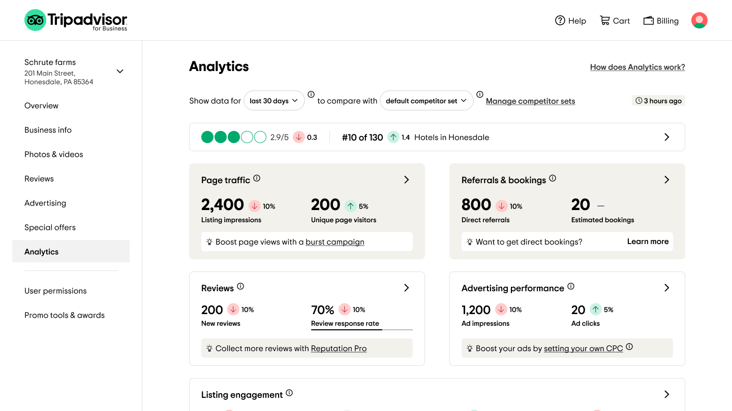
As a pivotal element of the migration initiative, I undertook the task of transforming the analytics suite. This initiative addresses one of the most critical yet often overlooked functions within the Tripadvisor management center.
[FYI: Those pages are not public-facing and only accessable by verified business owners on Tripadvisor. Performance data used in design is just for demo purpose and is not reflecting real life data of any businesses.]Goals:
The Analytics Suite project aimed to establish a versatile framework catering to the needs of both hotel and restaurant owners. This initiative sought to present a visually refreshing and easy-to-understand layout. The challenge lies in maintaining a delicate balance between providing ample information and avoiding overwhelming users. The envisioned page aimed to captivate visually while maintaining a clean color palette, all while ensuring the metrics provided valuable insights.
Context:
In the former B2B management center, separate performance reporting pages existed for hotel and restaurant owners. Crafted by distinct teams with varying requirements, these pages showcased divergent UX/UI designs and unique features. Notably, the project encountered the additional hurdle of three rounds of team transitions. I successfully navigated through working with two different Product Managers and three engineering teams across various project phases.
Challenges:
- The project complexity stemmed from integrating distinct dashboards into a unified solution adaptable for both hotels and restaurants while accommodating diverse metrics and maintaining design consistency.
- The UI intricacies demanded clarity and simplicity, enabling users to seamlessly comprehend the displayed data.
- Being able to work with ambiguity and drastic team changes through the process.


What did I do?
Work Process
01
Metrics Audit
Given the extensive data points spanning hotels and restaurants, the exhaustive understanding of metrics was pivotal.
02
Evaluation and Organization
Collaborating with Product Managers, we extensively assessed collected data points. Adjustments, additions, and subtractions were made, shaping a comprehensive metric spreadsheet for the final design.
03
Preliminary Mock-ups
Early concepts were sketched to explore potential layouts and to facilitate iterative evaluations with stakeholders. This phase streamlined expectations and refined design directions.
04
Mid-Fidelity Comps
After a suitable design direction was identified, further explorations were conducted to solidify UX/UI details. Demonstrative prototypes played a crucial role in fostering effective communication.
05
User Testing
With a stable design, user testing gauged real user responses to high-level design and uncertain UI elements. Invaluable feedback refined design robustness and rectified previously unnoticed shortcomings.
06
Refinement and MVP Scoping
Leveraging insights from user testing, design details were refined, and edge cases finalized. During this time, the team also solidified the MVP scope so that I was able to provide comprehensive design hand-off documentation.
Highlights
2-in-1
A singular design solution adeptly accommodating two diverse partner categories.
Utility level maximized
Transformed the page into a dashboard-cum-launchpad, maximizing usability.
Mobile friendly
Pioneered mobile-friendliness for our Analytics Suite, enhancing usability.
Worked with ambiguity
Withstood multiple rounds of team changes through the process, including 2 PMs and 3 engineering teams.
