This project involved a phased evolution of the Partner Overview page—the primary dashboard for Tripadvisor’s B2B Management Center. Facing stagnant conversion rates, we pivoted from a “loud” marketing strategy to a utility-driven approach that prioritized user tasks over upsells.
The backstory (2020-2023)
In 2020, the product and design team initiated a big migration effort to move the legacy management center to a brand new playform. The partner Overview page was one of the first pages gotten migrated with a MVP design. Over the following 3 years, the overview page stayed generally unchanged, except a few rounds of new feature additions and minor adjustments.


The 2024 experiment
Analysis between 2022 and 2023 showed that these “prominently” placed cards were seriously underperforming, failing to drive the expected conversions. Senior leadership also noted the product cards lacked visual prominence. In 2024, to combat the non-engagement of the overview page, a project to visually enhance the product cards started.
Let’s make it big & loud.
Being skeptical, I advocated for a live testing of the overview page against a new set of visually enhanced product cards. The team decided to ship it super fast and get it tested sooner ranther than later.


Changes made:
- Iamges: Eye-catching visuals to draw attention.
- Bold colors: Distinctive palettes for each product.
- Value prop: Expanded the value prop with persuasive, information-heavy copy.
- Pricing: Clear pricing to reduce friction.
Test it, real quick.
To get the concept tested sooner, we bypassed all the textbook product development process, and quickly designed and developed the new cards, and launched it to 50% of the traffic.
Six months later…

We need to understand our users.
I revisited recent user research reports to discover useful insights.
My PM took the chance to talk to a few users to chat about expectations.
After synthesizing all the findings, the product strategy became clearer than ever before.
Owners are busy, they want utility over upsells.
We realized they don’t visit the dashboard to be sold to; they visit to manage their business. To earn the right to sell, we first had to provide value. We pivoted to a Utility-First strategy: give them the tools to succeed, and the subscription becomes the logical next step.
Exploration & Iteration
With a clear goal, I started pulling things together to explore ideas.
01. Mining Historical Context
I audited my design archives dating back to the 2020 migration. By revisiting discarded functional explorations, I quickly identified high-value utility components that were previously sidelined.
02. Structural Blueprints
Once the core features were defined, I iterated on the page architecture. I focused on a modular layout that could scale, ensuring the “management” tools felt native to the user’s daily workflow.
03. AI-Assisted Brainstorming
To stress-test my layout, I used Lovable to generate rapid design concepts. This helped me identify potential UI gaps and provided fresh inspiration for data visualization details I might have otherwise overlooked.
04. Refining the Details
With the structure locked, I focused on precision. I used ChatGPT to wordsmith the UX copy for clarity and impact, while simultaneously fine-tuning the brand’s visual language, spacing, and accessibility.
05. Validation & Handoff
After several feedback loops with stakeholders, I finalized a design that solved the user’s need for utility while meeting our business goals. I then prepared a comprehensive design spec to ensure a seamless engineering handoff.
Final design
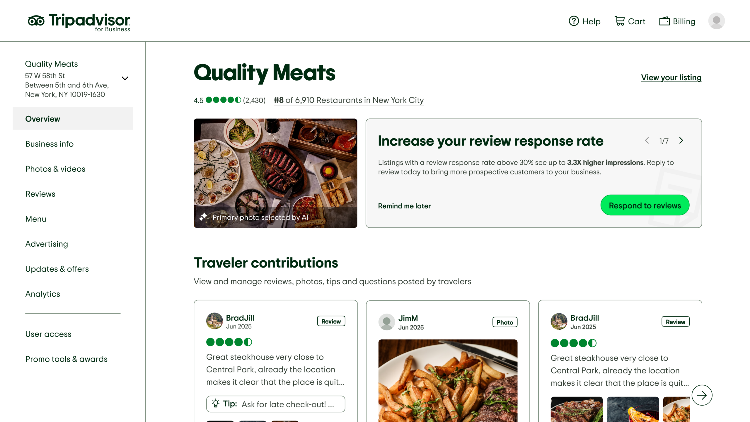
The 2025 redesign represents a fundamental shift in how we engage with partners. Instead of leading with a sales pitch, we transformed the Partner Overview into a high-utility dashboard that prioritizes the health of their business.
By integrating traveler contribution updates and listing performance metrics directly into their daily workspace, we provided immediate, tangible value. This “Utility-First” approach didn’t just improve the user experience—it built the professional trust necessary to drive conversion. We found that when users felt empowered by the platform, they were far more likely to invest in a product to further amplify their success.


Key results:
- 45% Year-over-Year Increase in Premium subscription purchases.
- Actionable Hub: Shifted the page from “Ads only” to a high-utility dashboard.
- Evidence-Based Growth: Proved that sustainable growth comes from aligning business goals with the user’s primary tasks.
A Quick Recap
2020
MVP Launch
The Overview page launched as a Minimum Viable Product (MVP) following a major platform migration. It served a purely functional purpose, containing basic listing information and a static shelf of product cards.
2021-2023
Fragmented Growth
The page saw several rounds of feature additions, but they were implemented in isolation. Without a holistic design strategy, the user experience became cluttered, and conversion rates remained flat.
2024
Visibility Hypothesis
We challenged the idea that “low discovery” was the root of low sales. We launched a high-impact, visually bold version of our product cards to 50% of traffic. The result was a “successful failure”—the data proved that making ads louder did not change user behavior.
2025
Utility-first redesign
Shifting from a marketing-first to a utility-first mindset, we rebuilt the experience around the user’s daily tasks. By providing actionable insights and business tools, we saw a 45% YoY increase in Premium subscriptions.